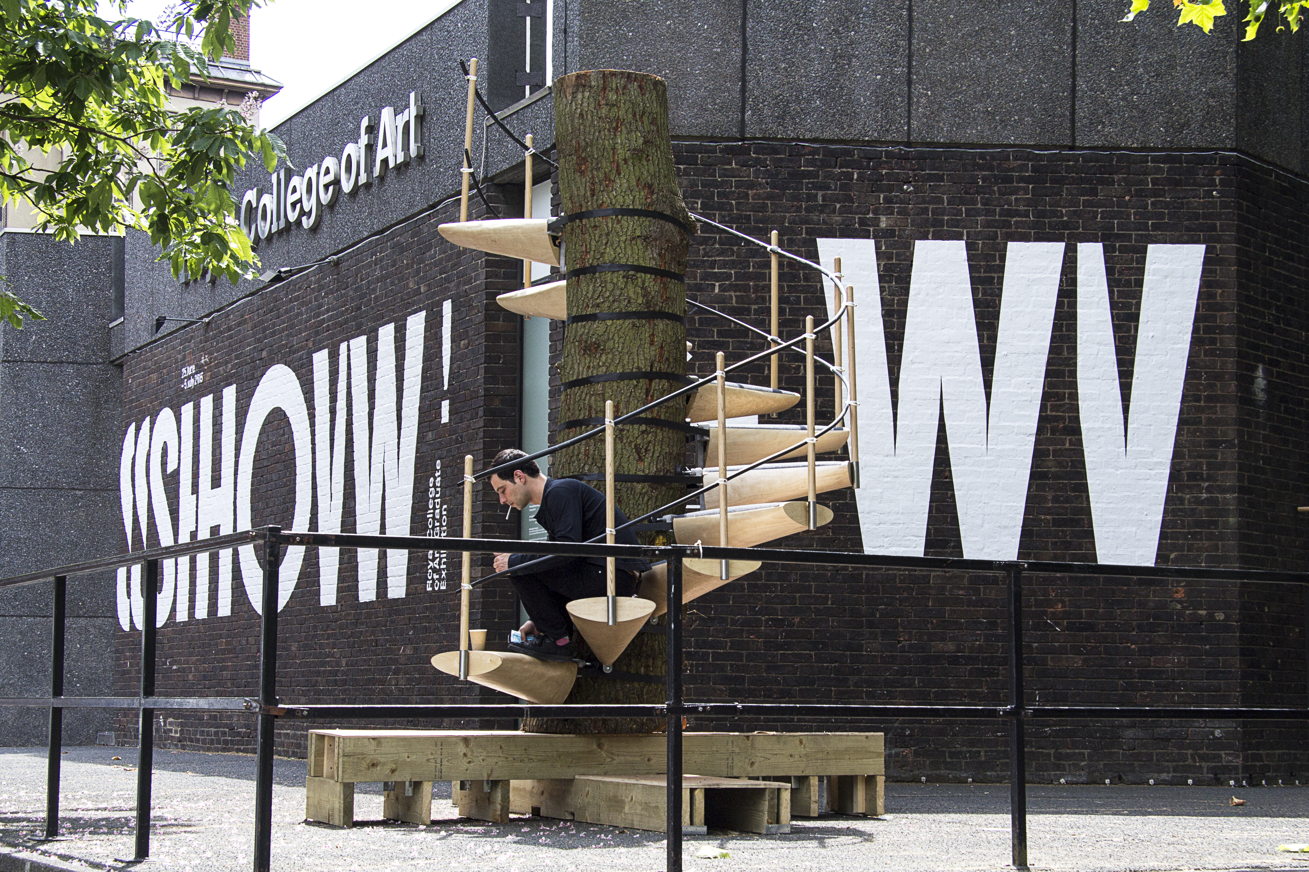
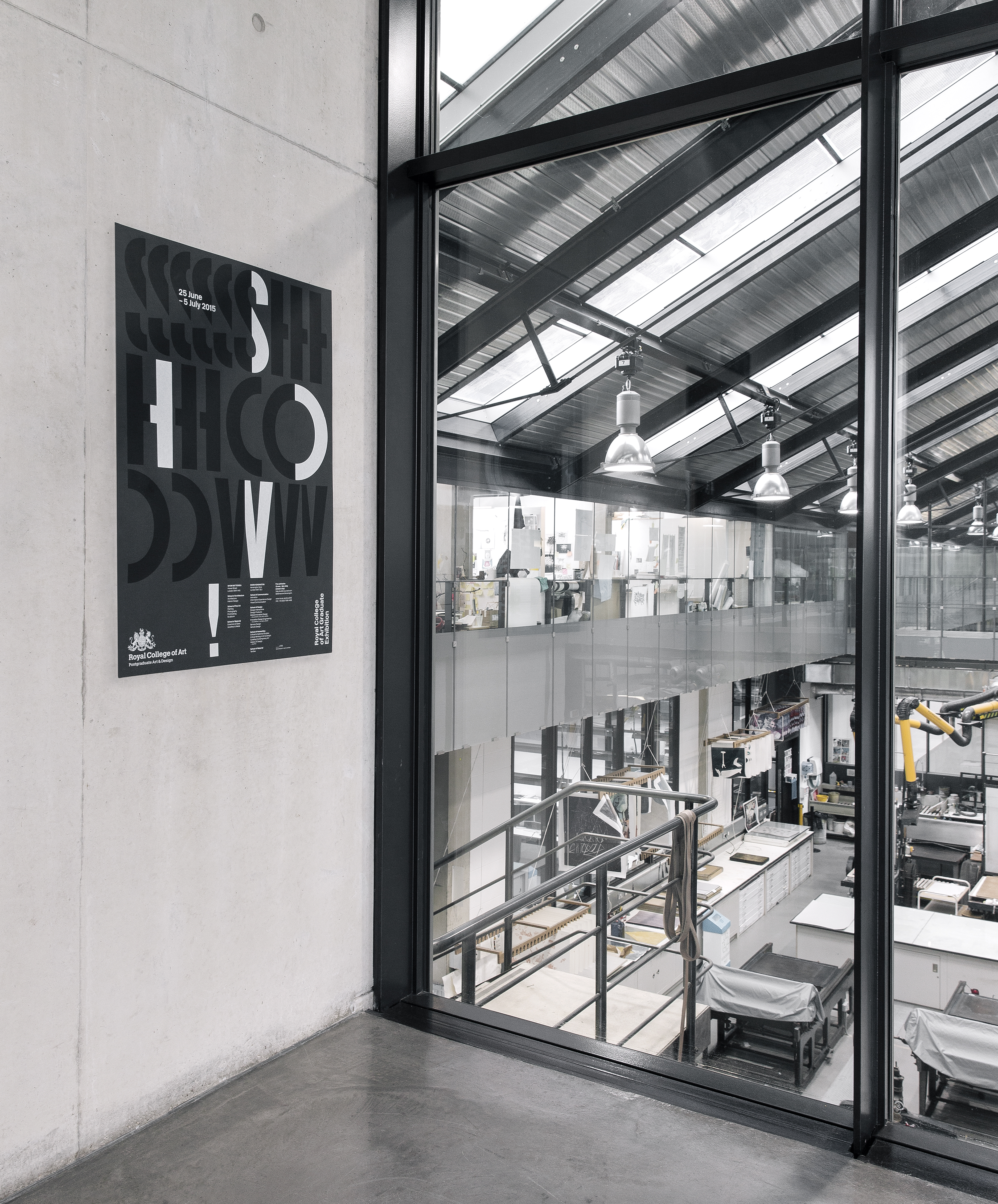
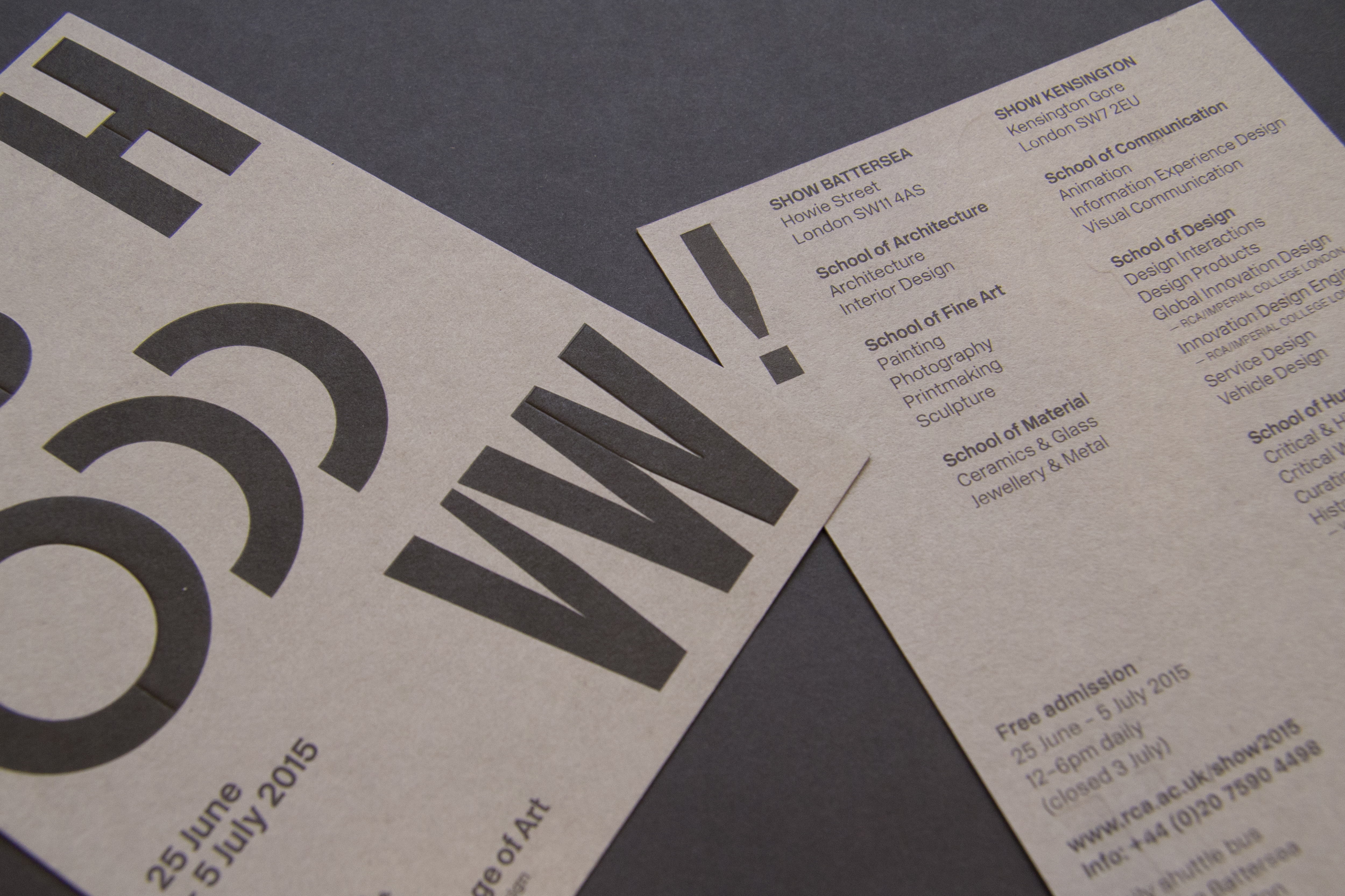
Inspired by the idea of foundations – a term that the wealth of knowledge and expertise at the College, the materials and tools provided for making, as well as the actual bricks and spaces of its buildings – the graphic identity for Show 2015 not only makes a simple, bold statement that allows the student work its place in the limelight but also provides a versatile and responsive system that can integrate with the exhibition spaces rather than dominate it. The new design reworks the impactful and bold Knockout typeface from the College’s visual identity. The letter forms are adaptive to physical space, so that oversized vinyl lettering can cut playfully across glass window panels, skip over door frames, and wrap boldly around corners, bringing galleries alive and creating key moments around the College’s buildings, while also providing an effective way-finding system.The design is responsive to the variety of materials typical of Show RCA, whether crisp white walls, cool concrete or temporary MDF structures. Heat-shrunk vinyl letters will adhere to brickwork, allowing the textures beneath to shine through, literally drawing on the building blocks of the College. Project made in collaboration with Jack Llewellyn.